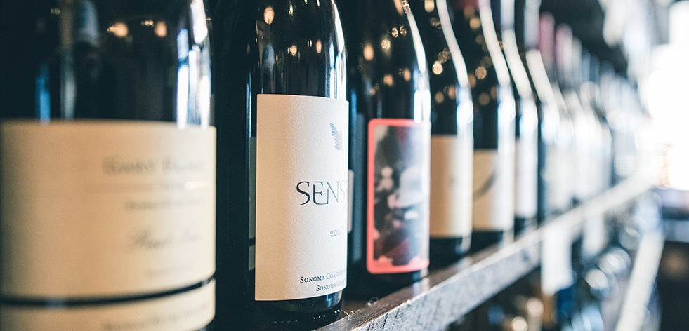
Wine lovers are confronted by a bewildering array of choices every time they enter a liquor store to select a bottle. Wineries, however, have a secret weapon with the use of eye-catching wine labels designed by artists as diverse as Marc Chagall and Reg Mombassa.
Label designer, John Jewell has a global clientele and offices in Australia’s Melbourne and Albury. Jewell is passionate about his work and is keen to express the impact that wine labels have on the consumer.
“If a wine label can’t capture the consumer’s attention, then it doesn’t matter how good the wine in the bottle is; it simply won’t make it off the shelf and into the glass,” says Jewell.
“The label is the mouthpiece of a wine; it needs to fluently convey the essence of what consumers can expect to taste inside the bottle. It all starts with understanding your market, and then building a memorable brand that is brought to life through outstanding design,” he explained.

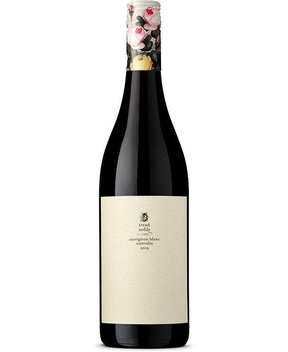
Labelling is also a key element for Nicholas Crampton, who makes wines under a range of labels including Elephant in the Room, Tread Softly and Little Giant for Newcastle-based Fourth Wave Wines and also imports wine from several European countries, including France and Spain. Fourth Wave uses several different designers to ensure variation in their wine labels.
“According to (monitoring service) Wine Intelligence, over 36% of consumers agree that packaging is important to them when choosing a wine,“ Crampton says.
“While price is very important to many consumers, at most price points there are multiple offerings, so a brand needs to stand out and engage consumers to beat their competitors. From observation, packaging is less of a deciding factor in purchase at more premium price points and more important for wines between $10-$20.”
Crampton adds: “The overriding rule is that the only point of a label is to engage the consumer. A crazy design created to make the designer look good is pointless if it doesn’t engage the consumer. A label designed for retail needs to stand out from at least five metres to enable buyers to be able to differentiate from a competitor on the shelf.”
“You have to remember that consumers struggle to remember brand names, so it pays to make sure the label has a memorable design feature, icon or shape,” says Crampton.
The trend of using famous artworks on wine labels was pioneered by leading Bordeaux wine producer Chateau Mouton Rothschild.
Since 1945 the family of aristocrats that own the winery have used paintings by famous artists as their labels. Mouton Rothschild has brought together some of the most celebrated artists of their day, including Miró, Chagall, Braque, Picasso, Tàpies, Francis Bacon, Dali, Balthus, Jeff Koons and even Prince Charles, the Prince of Wales.
The artists are given complete freedom of creation, though specific themes, such as the vine.
Leeuwin Estate winery, located in the Margaret River region of Western Australia and owned by the Horgan family, has since 1980 released wines under its Art Series label. These wines represent Leeuwin’s most opulent and age-worthy releases featuring labels with paintings commissioned from leading contemporary Australian artists.

The Leeuwin Estate collection now comprises over 150 paintings and artworks from artists including John Olsen, Arthur Boyd, Sir Sidney Nolan, Lloyd Rees, Albert Tucker, Fred Williams, Robert Juniper, Clifton Pugh and Imants Tillers.
The only work not part of the estate’s collection to feature on a label is Sir Arthur Streeton’s Golden Summer, which was offered by its then-owner for use on a special museum release of the 1987 Art Series Cabernet Sauvignon. Its new home is at the National Gallery of Australia.
In Victoria (Australia), pinot noir specialist William Downie teamed up with Reg Mombassa Australian-founded street and surfwear brand fame – and musician with Mental as Anything - to create artwork that helped get his fledgling brand into leading Melbourne wine stores.
Keira O’Brien, who produces boutique wines under her Rivulet label, was, meanwhile, inspired by Tasmanian landscapes.
“Rivulet Wines is an opportunity to work with fruit I see as a bit special and tilt the winemaking a little more playfully. It’s all small-scale stuff, and the name is a bit of a riff on that - tiny trickles of wine, rivulets of sweat on the brow,” O’Brien says.
In Tasmania, small streams are called rivulets, and several are depicted in the beautifully crafted labels by MONA collaborator David Campbell which reflect that.
In contrast, former Petaluma and Bay of Fires winemaker Peter Dredge was inspired by music for the labels of his Dr Edge range of pinot noirs.
“The artwork on the front is based purely on a music album cover,” says Dredge.
“I would consider myself equally as passionate about music as wine; mostly based around soul, jazz, funk, hip-hop, those sorts of styles.
“An album I used to listen to at Petaluma was called Headz: it was an experimental instrumental hip-hop album, had all these DJs and artists like The Beastie Boys, DJ Shadow, Nightmares on Wax and Massive Attack,” Dredge explains.
Dredge combined with Massive Attack musician and artist Robert Del Naja (aka 3D) and Damian Hamilton at Cornershop Design in Adelaide for his labels.
Also, in Tasmania, winemaker Nick Glaetzer from Glaetzer-Dixon family wines in Hobart does all his label artwork. His bottles mainly feature text-based designs in his signature white, red and black.
When visiting Longview Vineyard at Macclesfield in the Adelaide Hills of Australia, visitors will notice large pieces of street-art, inspired by the winery’s annual Adelaide Piece Project event.
The pieces are a result of six local artists going head to head in a live street-art display. The winning artwork becomes the label of Longview’s premium, reserve shiraz, known as The Piece.
Colourful one-off releases, with bespoke tins or cooling jackets, also make for impressive design, like Piper-Heidsieck’s Australian Open tennis special release.
Some wineries, including market-leading Penfolds with wines including $895-a-bottle Grange, make only minimal changes from vintage to vintage. Penfolds Grange is considered Australia’s first growth and the label remains mostly unchanged since 1952.
“For many decades, Penfolds has maintained a considered and consistent approach to our wine label designs,” says Kristy Keyte, Penfolds’ Global Marketing Director.
“From Grange to Koonunga Hill, all wines in the Penfolds house display a consistent suite of key brand assets on pack that make our wines distinctive and recognisable globally. It’s important to retain design consistency across our entire portfolio, especially for wines like Grange and Bin 389, which continue to top Australia’s ‘most cellared wine lists’, Keyte says.
She emphasises, “After the wine itself, it’s these visual cues, coupled with brand heritage and traditions, that make our wines appealing to collectors.”
Likewise, the classic label that Wynn’s Coonawarra Estate adopted in the 1950s remains essentially the same well over half a century later. And what of back labels, where you find all manner of minutiae?
“Back labels can certainly assist in telling the story, and there is solid evidence that many consumers read them,” says Crampton.
Wine labels, in their most basic form, date back as far as 1550 BC in Egypt. Seals and etchings were placed on bottles, or amphorae signifying the year, type, and quality of the wines.
By the 18th century, labels were being printed on parchment and tied to the bottlenecks with string, much like the tags still seen today.
From 1798, labels could be produced in mass, thanks to the invention of the lithograph, which led to increased use of colour and more emphasis on artistic design.
Design aside, each label – no matter how outstanding or dull - must comply with the strict alcoholic beverage labelling regulations in the country in which it is sold.


